Dear Friends and Community Members, We are thrilled to announce the launch of our refreshed…
At HACOCA, we are excited to announce a significant milestone in our journey to serve and empower communities: the refinement of our brand. This transformation reflects not only a fresh visual identity but also our ongoing commitment to creating meaningful and sustainable change in the lives of the people we serve.
Why Refine Our Brand?
Over the years, HACOCA has evolved to meet the growing needs of communities. Our interventions have expanded to address not just families but entire communities, focusing on health, education, and socio-economic empowerment. To better represent this evolution, we have refined our brand to align with our broader philosophy of community-driven transformation.
The changes in our brand are guided by our mission to remain impactful, relevant, and forward-thinking while staying true to our core values of service, accountability, compassion, partnership, and innovation.
What’s New in Our Brand?

Our brand refinement includes two key updates:
1. A New Logo:
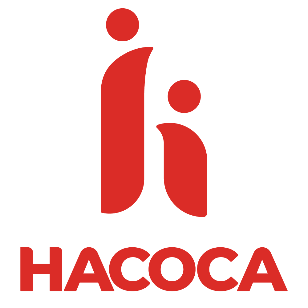
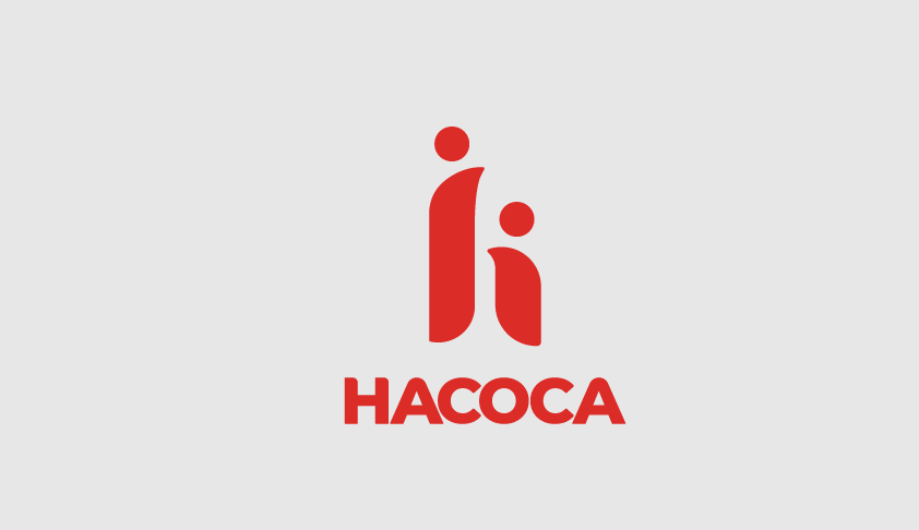
The redesigned logo builds upon the foundation of our previous emblem. The new design merges the figures of a parent and child into a united representation of society as a whole. Together, these figures form the shape of the letter “H,” which symbolizes “Huruma” (compassion) and remains central to our identity. The updated design conveys a sense of unity, happiness, and health, emphasizing our holistic approach to addressing community needs.
2. Refreshed Colors:
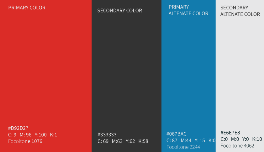
Red is now the dominant color in our logo and branding materials, representing vitality, compassion, and energy. This vibrant color underscores our commitment to fostering health and socio-economic well-being. The new color palette is modern and cohesive, aligning with our vision of inclusivity and progress.
What Stays the Same?
While our visual identity has been refined, our mission, vision, and values remain steadfast. HACOCA continues to focus on:
- Empowering children, youth, and women.
- Promoting health, education, and economic self-sufficiency.
- Driving sustainable development through community-led initiatives.
Our dedication to serving the most vulnerable is stronger than ever, and this brand refinement reflects our renewed energy and focus.
A Message to Our Stakeholders
This brand refinement is not just a change in appearance; it’s a statement of our growth and a reaffirmation of our mission. We invite all our stakeholders—partners, donors, beneficiaries, and the public—to embrace this transformation with us. Together, we will continue to build healthier, stronger, and more resilient communities.
What’s Next?
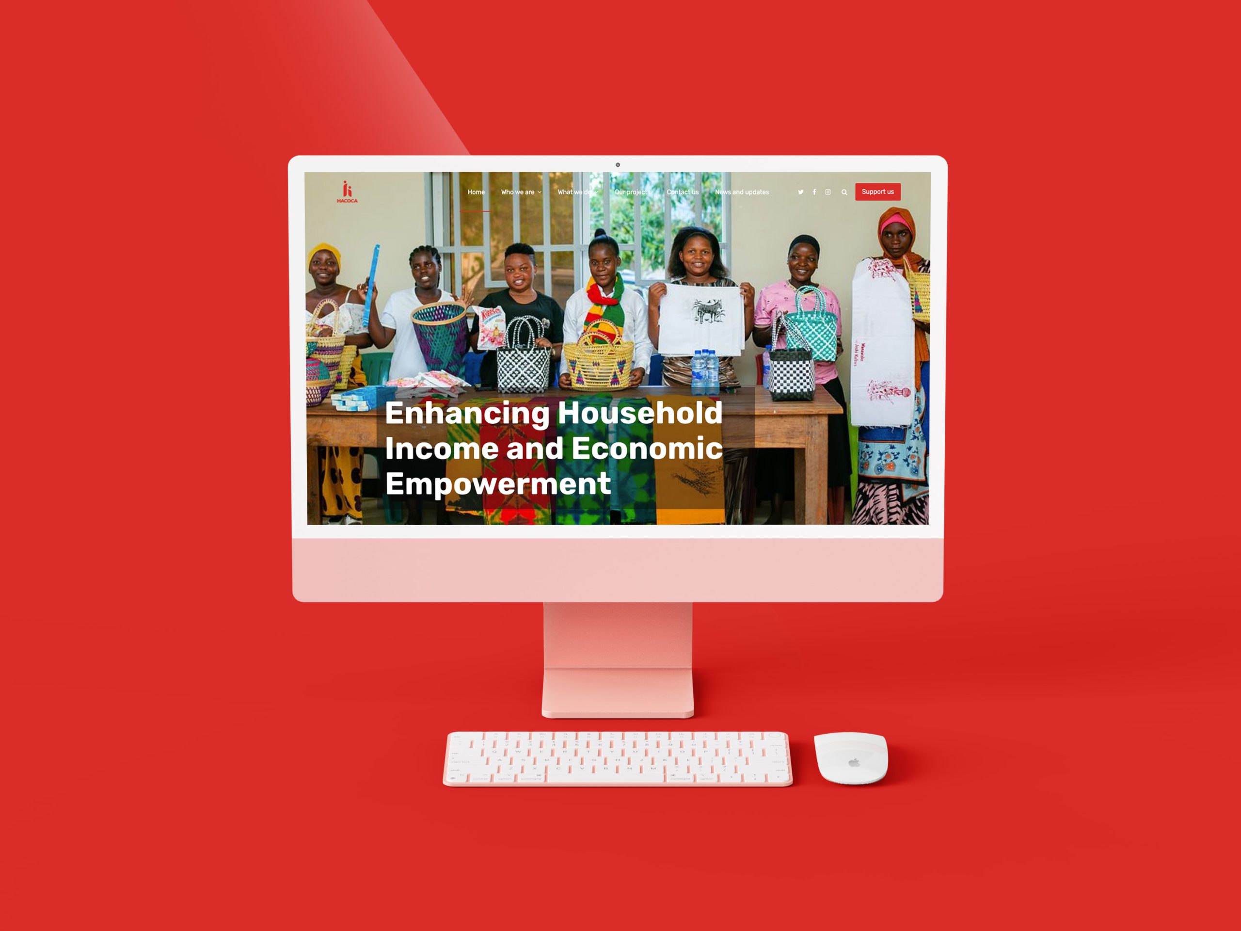
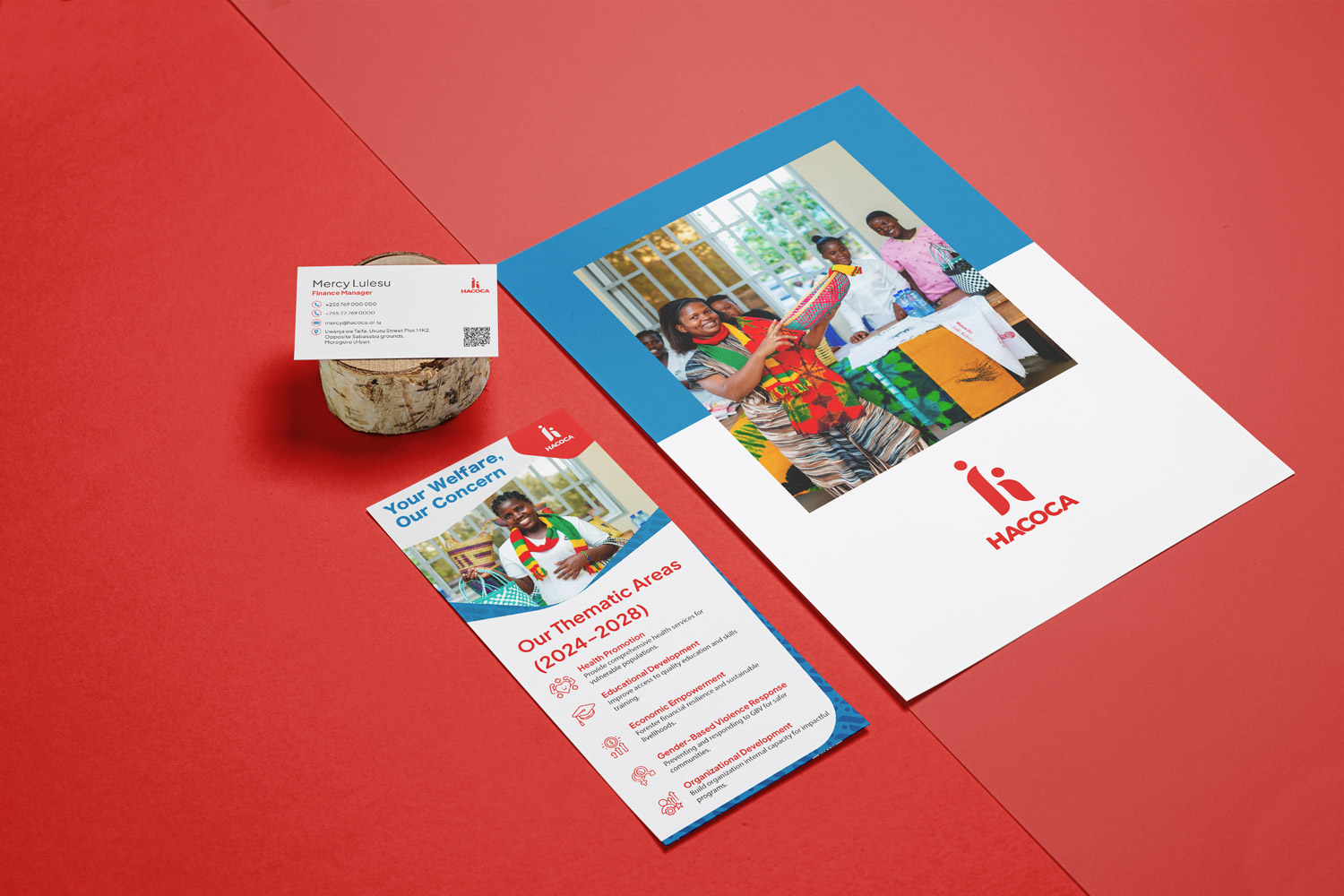
As we integrate this new brand across all our platforms and materials, you will begin to see the updated logo and colors in our communications, events, and initiatives. This transformation represents a fresh chapter, one that inspires hope, progress, and collaboration.
We thank you for your unwavering support and partnership as we embark on this new journey. Together, let’s create a brighter future for the communities we serve.
Join us in celebrating this transformation! Together, we can achieve even greater impact.
